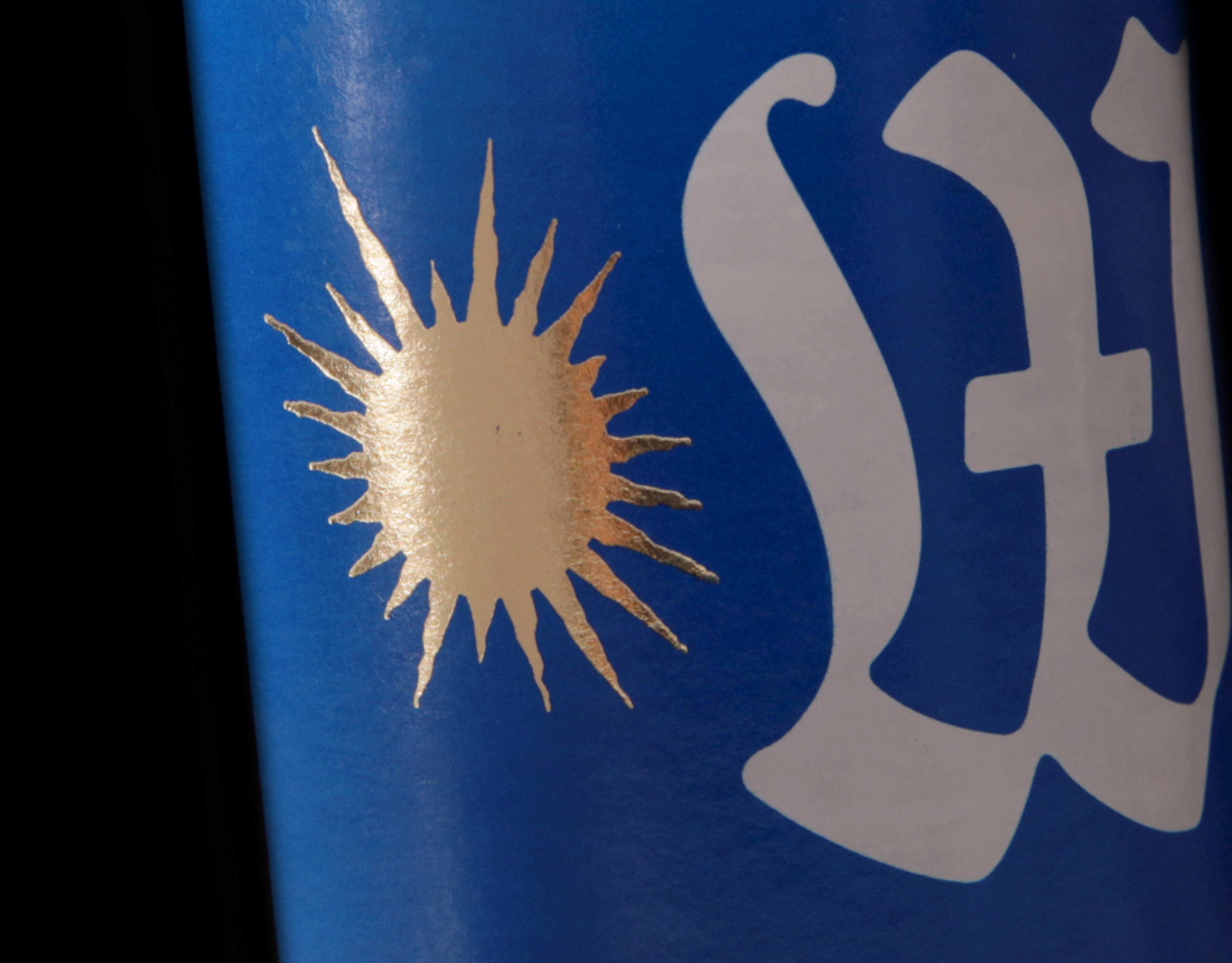
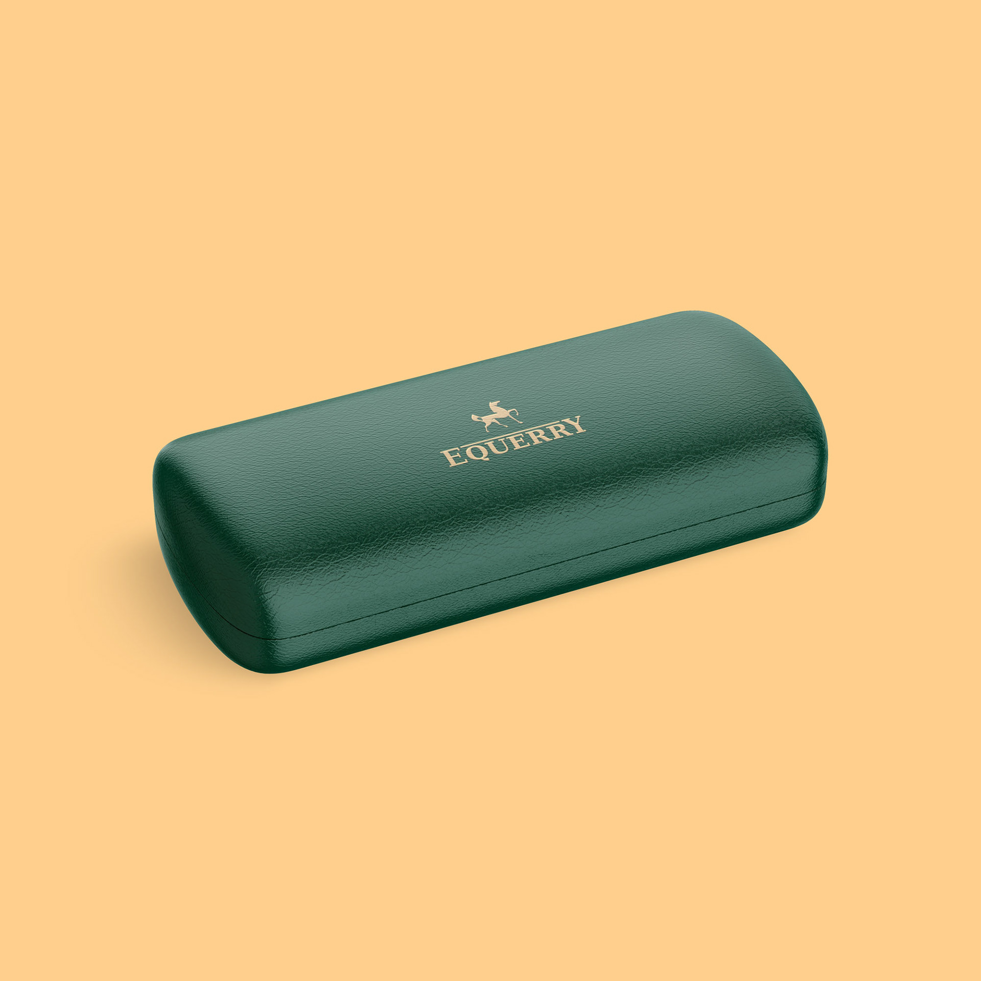
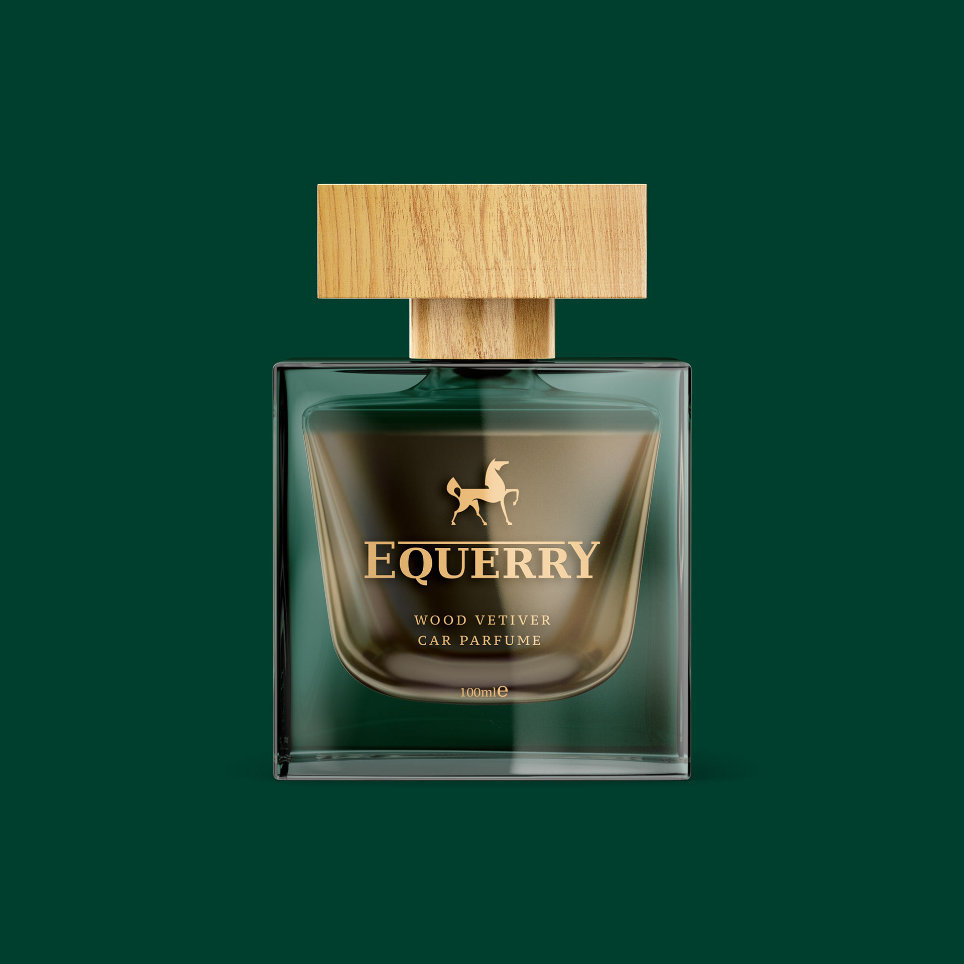
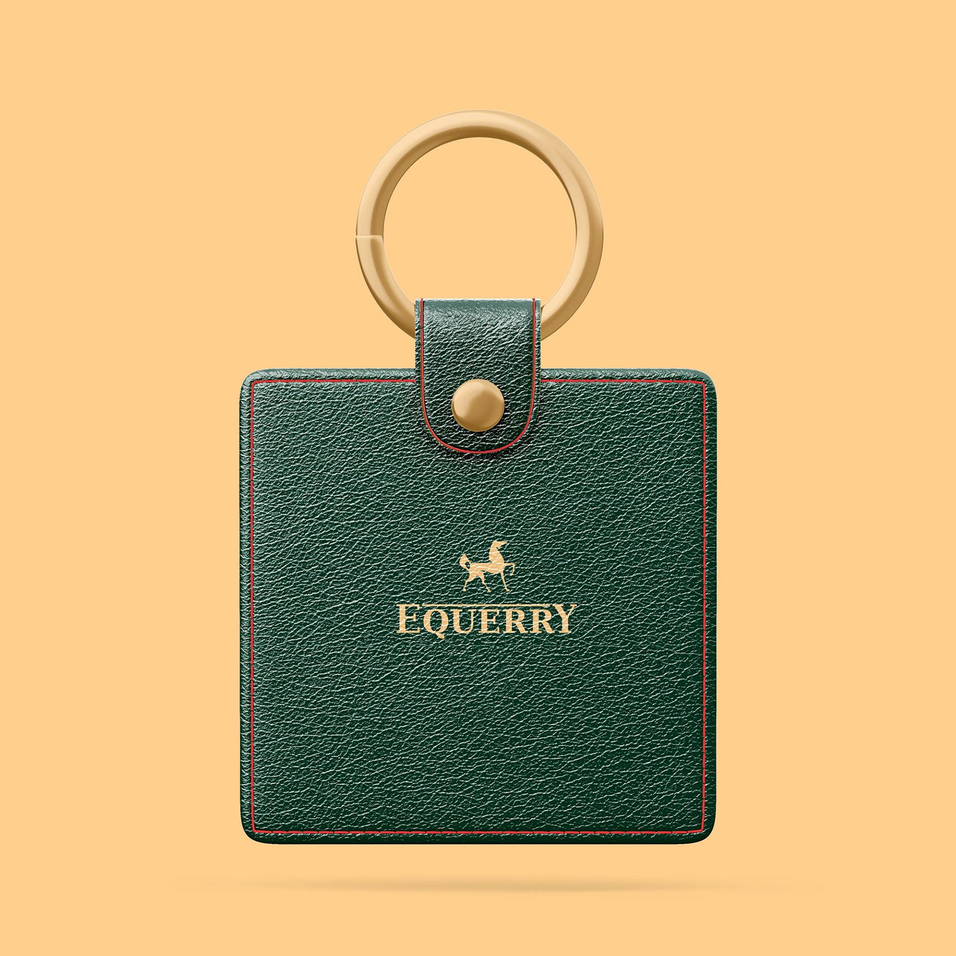
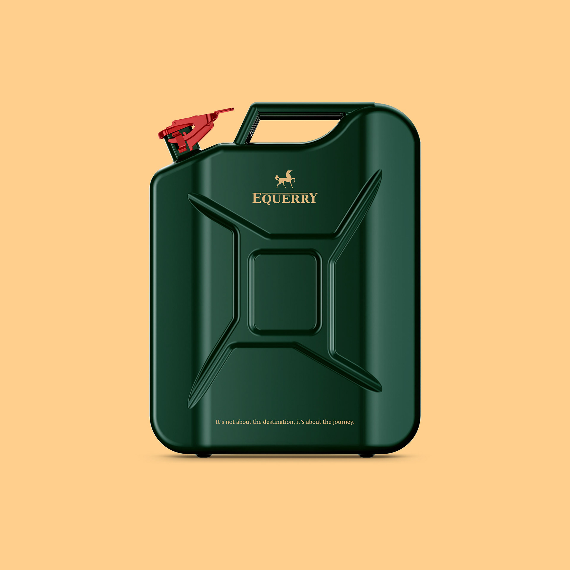
I was approached by a startup named Equerry, which aimed to redefine car concierge services. The concept was simple yet powerful: whether you need an oil change during a meeting, a car wash while waiting for your child at dance class, or a luxury car delivered as a gift with a big bow, Equerry would handle it seamlessly. The name “Equerry” draws from the historical role of a person responsible for the care and management of horses, ensuring they are always in top condition. Translating this to modern times, Equerry focuses on “iron horses”—our cars. The essence of the brand is reflected in the main logo, featuring a beautifully stylized horse, symbolizing the meticulous care and attention that results in a flawless outcome. The logo embodies the startup’s mission: to ensure every car under their care is always at its best, much like the prized horses of a royal stable.
To enhance the brand’s identity, we chose British Racing Green as the primary color, a shade that exudes elegance and sophistication. This color choice added a classic touch to the brand, aligning perfectly with the premium and attentive service that Equerry provides. The overall identity, from the logo to the color palette, conveys a sense of trust, quality, and refinement, ensuring that every car under their care is always at its best, much like the prized horses of a royal stable.

May the horse be with you.
