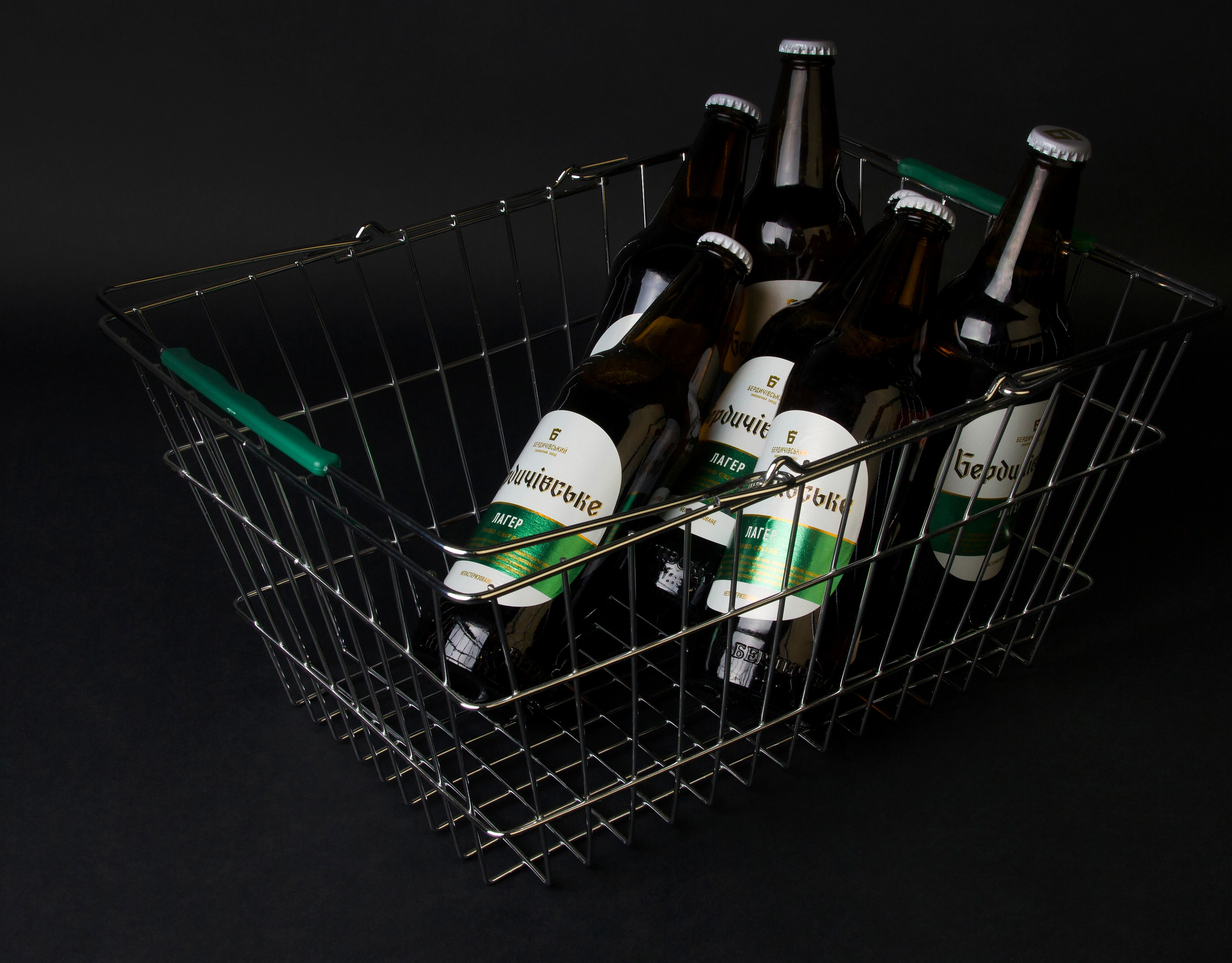
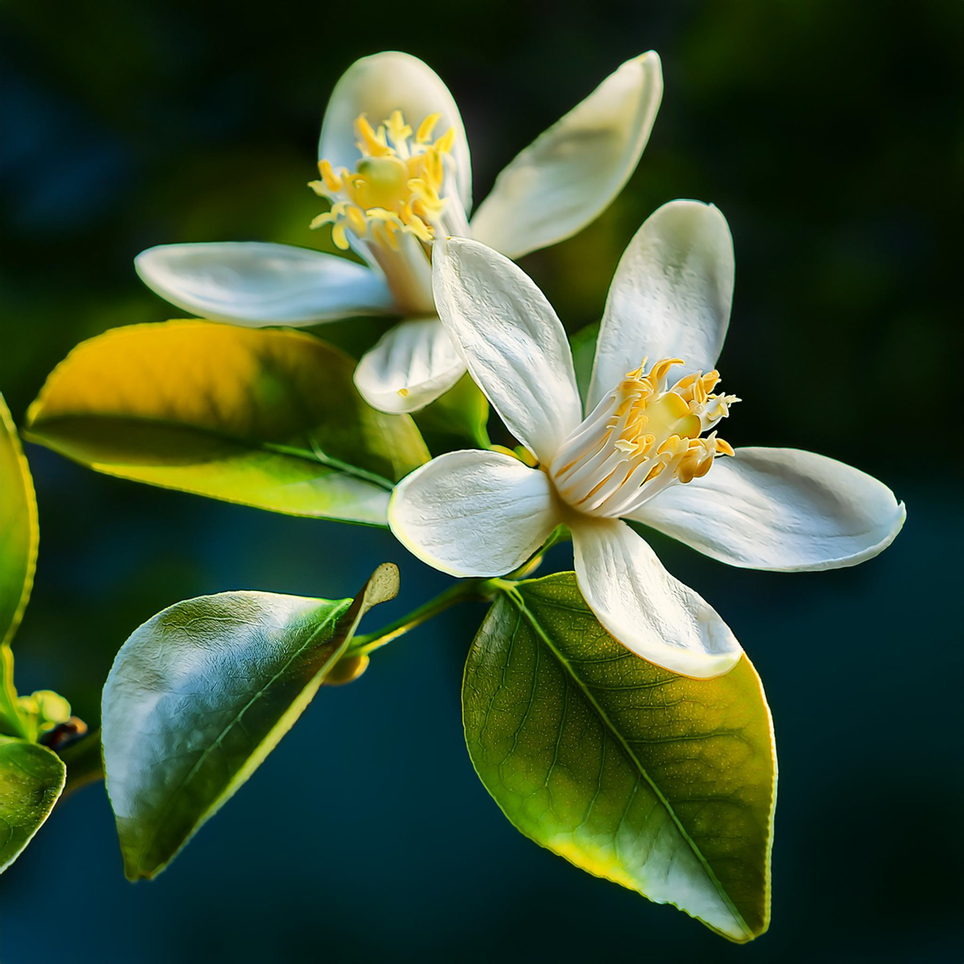
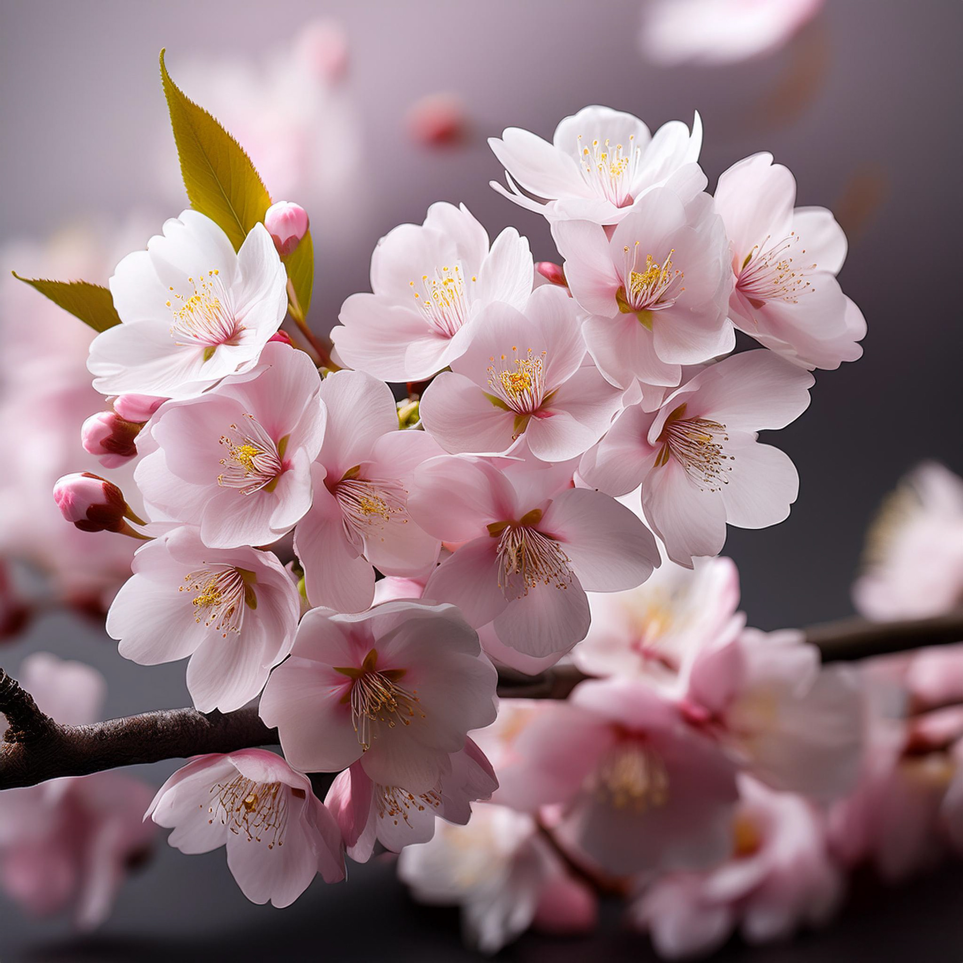
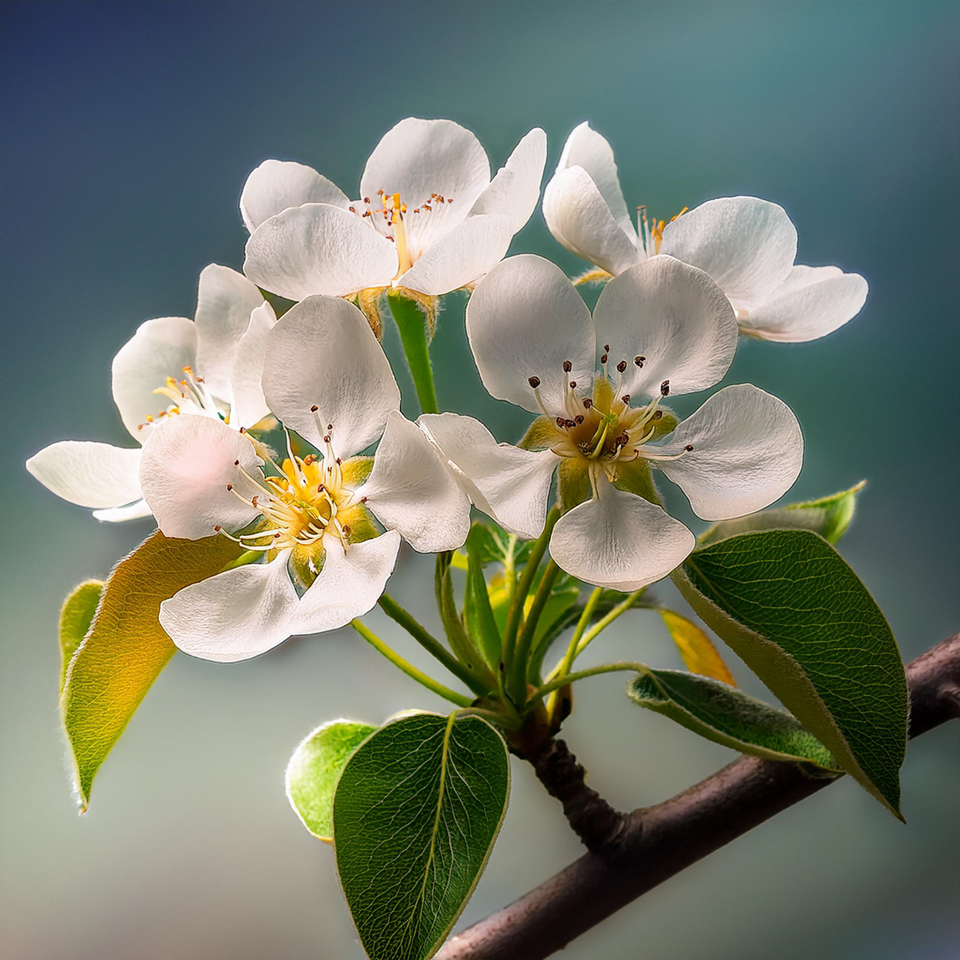
We collaborated with Umanpivo on updating their beer labels when the client proposed revamping their cider label as well. While the existing label had no major issues, it lacked a distinct character. After conducting research, we discovered that 70% of cider buyers were women, and most competitor labels were quite generic. This insight led us to the idea of creating a more delicate, feminine design. Instead of the typical fruit images symbolizing the cider flavors, we opted to feature the blossoms of the fruit trees—apple, lemon, cherry, and pear—to evoke a fresh, elegant feel.
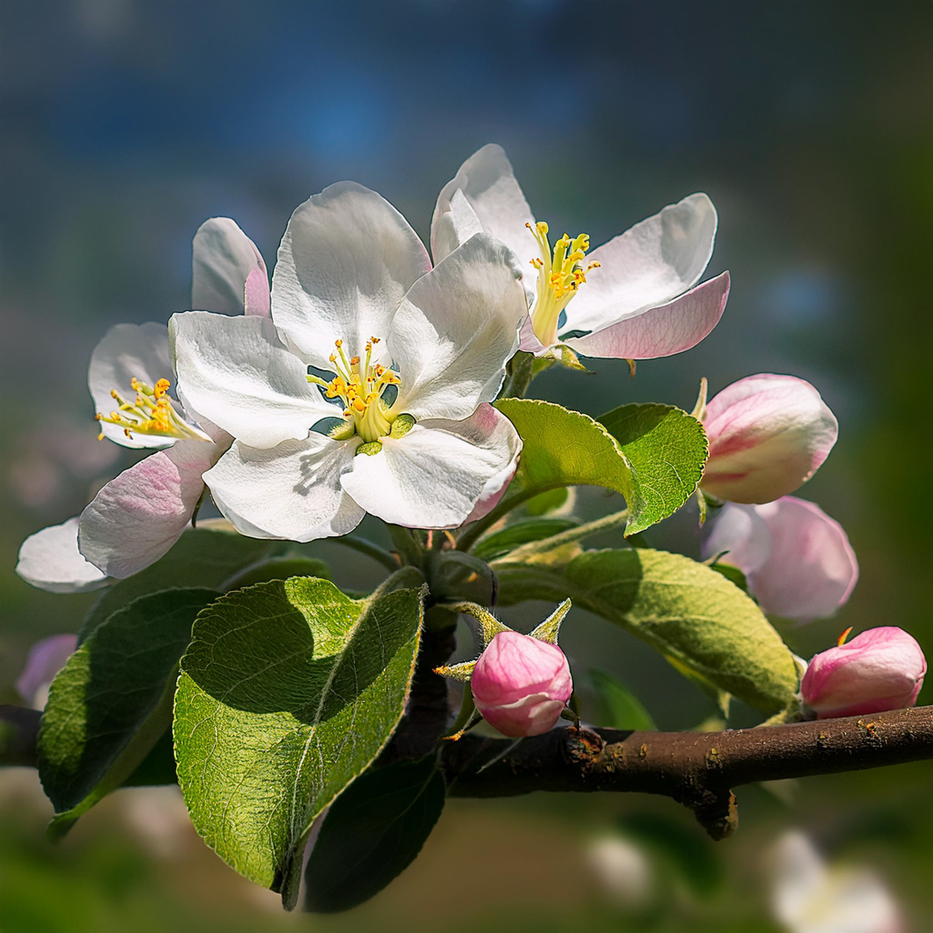
To bring this idea to life, we hired an illustrator who painted the flowers using watercolor, adding an extra light and tender feel to the design. This artistic approach enhanced the overall softness and made the labels stand out on the shelves.
