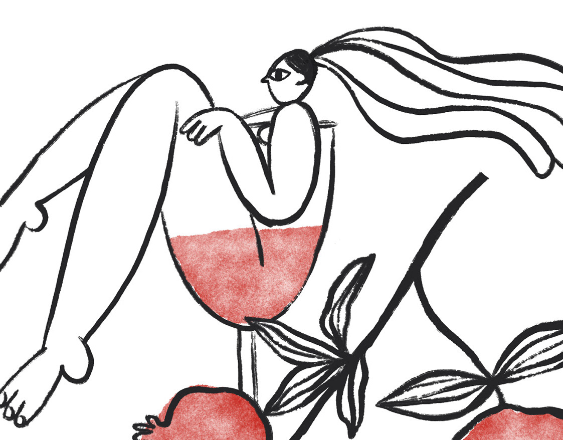
FO (ФО) — is a chain of stores of organic fruits (stand for F in the name) and vegetables (stands for O in the name) that was about to launch at few location in Ukraine's capital. We have sucessfuly created brand strategy, name, visual identity and a concept of the interior design.
Our customers' ambition: To take more care of their health with less effort.
Insight: Our target audience are snobs a bit, they like to think they know something that others don't. And while others "just buy calories", our audience is smarter and tries to invest in their health. "Often when I go to the store I have to read labels, think, choose what's healthy and what's not. It's annoying. I want to buy everything in a row, without remorse."
Brand territory: Health
Brand positioning: Na zdorov'ya — idiom meaning to your health and cheers. We do everything about health. Let our competitors do the rest.
Slogan: Have anything Because all our products are healthy and you don't have to choose, you can have whatever you want
Color palette consists of 5 main colours and 5 complimentary shades. All colours resemble fruit and vegetables.
There are different options of the logo which can be used in communication. It is enough to place a logo with a circle around some fruit to have a branded medium.
